Pantone Color of the Year 2015: Marsala

Pantone_Color_of_the_Year_Marsala_Slider

Pantone; the global authority on color, has release the 2015 Color of the year: Marsala – a naturally robust and earthy wine red, Marsala enriches our minds, bodies and souls.

For the past 15 years, Pantone has influenced the color decision-makers in many industries. Here is a list of the previous Color of the Year.

  • PANTONE 18-3224 Radiant Orchid (2014)
  • PANTONE 17-5641 Emerald (2013)
  • PANTONE 17-1463 Tangerine Tango (2012)
  • PANTONE 18-2120 Honeysuckle (2011)
  • PANTONE 15-5519 Turquoise (2010)
  • PANTONE 14-0848 Mimosa (2009)
  • PANTONE 18-3943 Blue Iris (2008)
  • PANTONE 19-1557 Chili Pepper (2007)
  • PANTONE 13-1106 Sand Dollar (2006)
  • PANTONE 15-5217 Blue Turquoise (2005)
  • PANTONE 17-1456 Tigerlily (2004)
  • PANTONE 14-4811 Aqua Sky (2003)
  • PANTONE 19-1664 True Red (2002)
  • PANTONE 17-2031 Fuchsia Rose (2001)
  • PANTONE 15-4020 Cerulean (2000)

To find out more about Pantone please visit their website at Pantone.com.

Posted in Design, Pantone Color of the Year | Tagged , , , | Comments Off on Pantone Color of the Year 2015: Marsala

Posted in Uncategorized | Comments Off on

The Mix Trend Wall recap at the Surface Design Show

IMG_0040IMG_0047IMG_9973

Global Color Research

Good morning everyone!

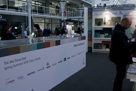
The Global Color Research team is back in the office off the back of another hugely successful Surface Design Show!

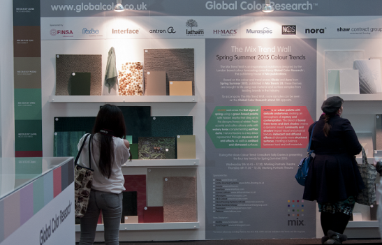
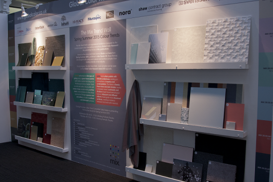
This year we presented our colour trend themes for Spring Summer 2015 Glade and Aura on our Mix Trend Wall. Using real life samples given to us by our sponsors we were able to bring our trend stories to life and show their diverse application to surface and material design.

The Mix Trend Wall showcased an exciting collection of samples from companies who are at the forefront of material and surface innovation. In Glade natural texture was a key driver with aqueous effects captured in Tektura’s wallcovering, Svensson’s high sheen fabric, and Nora’s rubber flooring.

In contrast, arid effects translated into calming pattern and colour ways in carpeting by Shaw Contract Group, Interface, and Invista. This soft flooring perfectly complemented solid colour laminates…

View original post 291 more words

Posted in Design, Global Color Research, Surface Design Show 2014 | Tagged , , , , , , , | Comments Off on The Mix Trend Wall recap at the Surface Design Show

PANTONE – The global authority on color – releases Fashion Color Report Fall 2014 in time for New York Fashion Week

PANTONE Fashion Color Report Fall 2014

Posted in Pantone Fashion Color Report Fall 2014, Uncategorized | Comments Off on PANTONE – The global authority on color – releases Fashion Color Report Fall 2014 in time for New York Fashion Week

Enlightening new publication soon to be released from Lecturis and Studio Formafantasma including contributions from Li Edelkoort.

stedelijk_formafantasma_invitationStudio Formafantasma, known for their remarkable combinations of materials, will have a solo show entitled “Prima Materia” at the Stedelijk Museum’s-Hertogenbosch on the 16th of February in the Netherlands. In addition they will also produce their first publication sponsored by the museum and Lecturis, a well known printer and publishing house in Eindhoven. The publication will contain original contributions by such well known personalities as Alice Rawsthorn, Li Edelkoort, Joana de Almeida Meroz, Louise Schouwenberg, Marco Petroni, Libby Sellers and Frederic Baas with graphic design by Bettina Madita Bohm.

The book is available starting February 15th through Lecturis or you can pre-order at:  www.lecturisbooks.nl/en/webshop/formafantasma/49836.

The exhibition, which opens from February 15th and runs through June 15th is curated by Frederic Baas and the guest speaker at the opening will be Li Edelkoort.

You can view additional pictures of their design work at the thisispaper magazine website.


Posted in Design, Studio Formafantasma | Comments Off on Enlightening new publication soon to be released from Lecturis and Studio Formafantasma including contributions from Li Edelkoort.

Transparent – Themes in Clothing Design

Posted in Uncategorized | Comments Off on Transparent – Themes in Clothing Design

Tom Darracott: Kiss Kiss

So here is yet another very inspiring video using an all black motif which has become the tool of the day.  However, in these few seconds of bliss you will find yourself craving each subject, lipstick to belted radials, the use of the shiny black slickness captivates and makes you want to experience more.

Posted in Uncategorized | Tagged , , , , | Comments Off on Tom Darracott: Kiss Kiss

Timo Böse: Still life…. reconceptualised!

For the annual Toca Me Design Conference in Munich this past 16th of February 2013, comes a video directed and conceptualised by Timo Böse. It is an introduction to the focal artists at the conference and is both benign and intriguing due to the use of a variety of subtly changing elements. Enjoy!

Posted in Still Life | Tagged , , | Comments Off on Timo Böse: Still life…. reconceptualised!

Crafts: A matter of scale and pace | Design Indaba

handmade-pottery-from-Moroc-1woven-carpet-by-Egg-Tradingcotton-kadi-from-India-by-Hsilk-and-cotton-kadi-from-IThe following article was crafted by Li Edelkoort and posted in early February of 2009.  Due to its overwhelming importance and relevancy to now, we felt it appropriate to re-visit her thoughts on “craft of a smaller scale, slower pace and a sustainable style.” Photographs courtesy of Design Indaba.

Enjoy!

Crafts: A matter of scale and pace | Design Indaba.

Posted in Uncategorized | Comments Off on Crafts: A matter of scale and pace | Design Indaba

PANTONE Releases Fashion Color Report for Fall 2013 in time for New York Fashion Week, February 7 – 14, 2013

http://www.pantone.com/images/pages/21057/F2013/fcrf2013_video.html#ooid=pvcjQ0OTrH8l6sM-3T4XZ-qcJDRy73wM

Leatrice Eiseman, executive director of the Pantone Color Institute, describes in depth the choices for the Fall 2013 Fashion Color Report. “The fall 2013 palette allows for that versatility and experimentation” says Ms Eiseman and that is exactly what you will find with the color choices which are actually a poll of the most popularly used colors by some of fashions top names.

Posted in Uncategorized | Tagged , , , , , | Comments Off on PANTONE Releases Fashion Color Report for Fall 2013 in time for New York Fashion Week, February 7 – 14, 2013